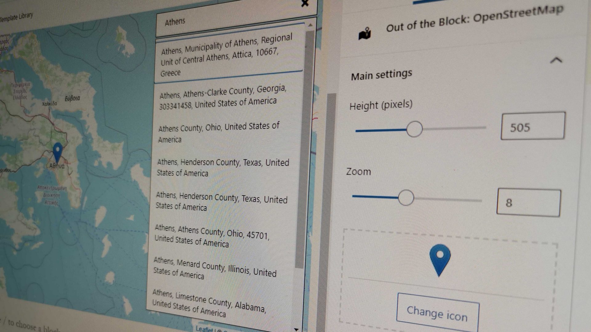
When I introduced an OpenStreetMap block for Gutenberg, I highlighted the importance of some sort of place search functionality, more or less based on the example of Google Maps. As the core idea of the plugin was that it should work out of the box block, the place search shouldn’t rely on a service that requires an API key. My research has shown that the most established such service was Nominatim, which uses OpenStreetMap data to find locations on Earth by name and address (geocoding).
While an excellent solution, though, Nominatim has some reasonable limits on its usage policy, the most important for us being that it does not allow an auto-complete search. Therefore, I had to build a more old-fashioned mechanism, where you type your keywords and click on a button to trigger the search. So, how can we improve it and make it as user-friendly as possible? Trying to do so, I realized that when you build something like this from scratch, there can be many little details that need to be taken into account.
Consistency between frontend and backend
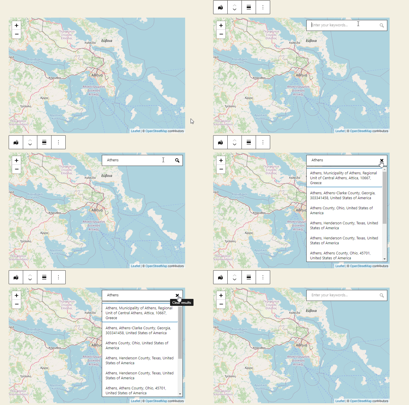
One of the major benefits of Gutenberg is that it allows you to see on your backend almost exactly what you see on the frontend. Therefore, the search box shouldn’t give the impression that its part of the frontend functionality. A workaround to that would be placing it on the Sidebar controls. It would be too far from the map on the desktop, though, and completely hidden on mobile. So, my preferred way of dealing with it was showing it only when the block gets selected.
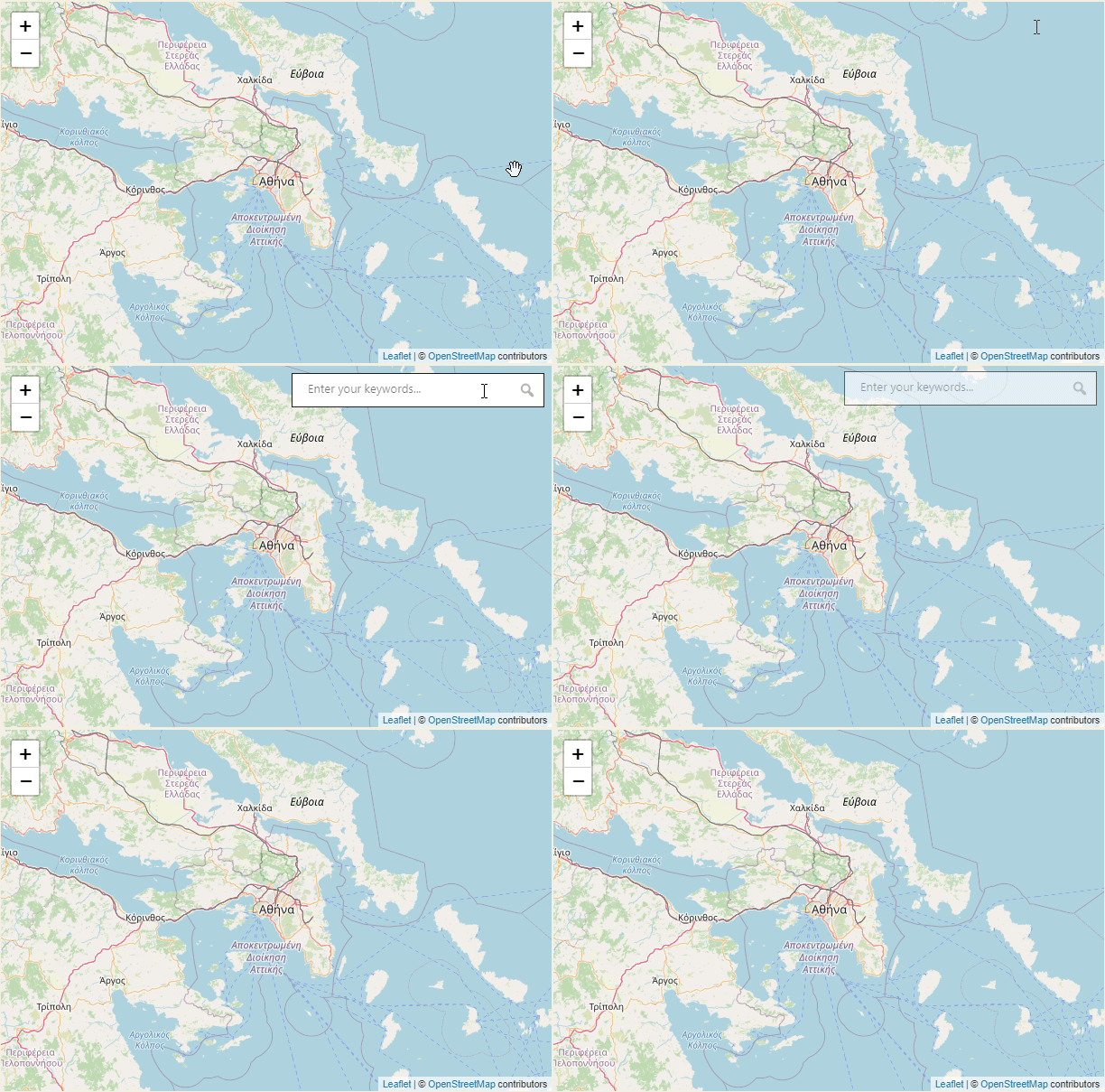
The different states of the search button
Simply throwing a button that triggers the search will do most of the job (the most important part, actually), but leaving it there would be sloppy. The search button could help us guide our user with hints on how to use our app.
First, we should make clear when it is inactive, by lighten-up its color. Clicking on it at that state will do nothing. On top of that, we put a limit of at least 3 characters for the search functionality to be activated. That is an additional precaution against excessive calls to the API, which would not trigger meaningful results.
When entering a long-enough keyword, the button gets activated, and clicking on it will display the results. At that point, the button’s role changes, as it gets transformed into an “x” mark, clicking on which will clear the results, clear the keywords, and set the focus on the input for the user to start a new search. Both states are accompanied by brief tooltips.
Alternative triggers: Look ma’ no mouse!
Clicking Enter after typing your keywords is something that comes out naturally and not implementing it would be a miss. Why not trying to take it one step further, though? If your keyword is specific enough, then the first result would probably be the one that you are looking for. That’s why when the results appear, we move the focus on the first result.
That way, a second Enter in a row will select that result and throw it on the map. Then, the search box gets cleared again and the focus goes back to the input field. The benefit of that is that we can add multiple markers in a row very easily, just by typing keywords and clicking double-enter, without having to touch our mouse.
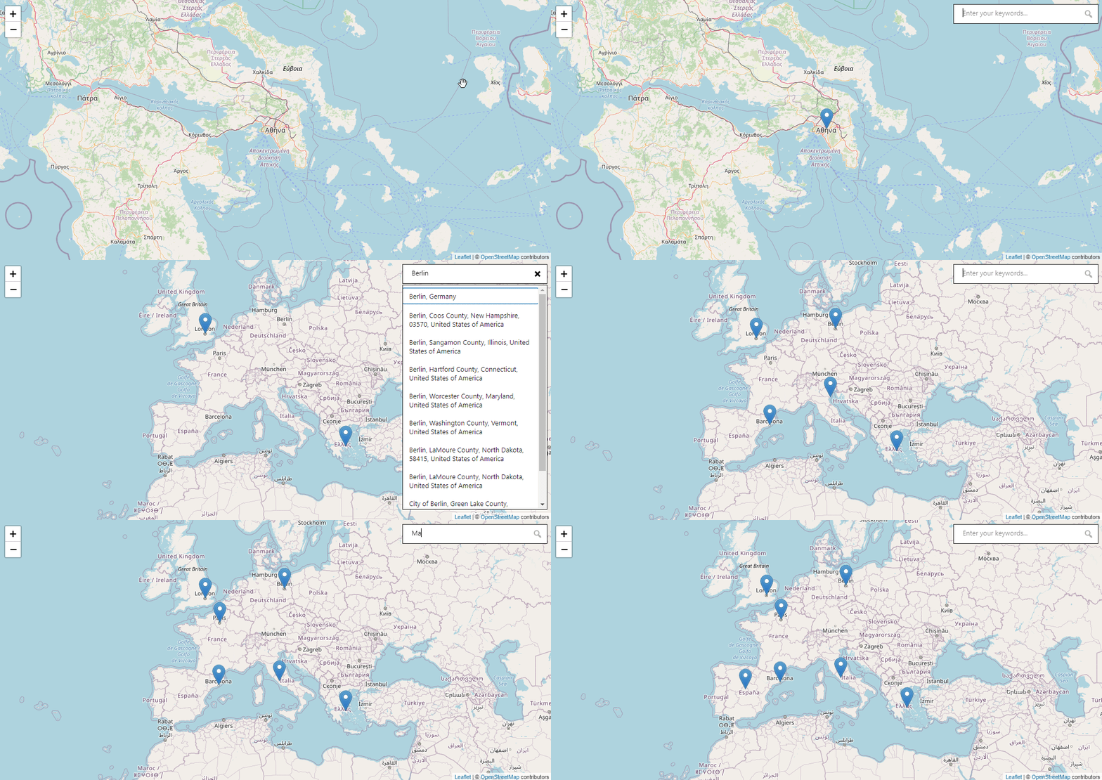
(enter is our friend, Double-Enter with the right focus is a BFF)
Use “Gutenbergy” design
The search box isn’t a part of the frontend functionality, which is why it seemed right that it should resemble the style of Gutenberg elements, instead of something fancier. It is a block’s control, after all, and it should probably be more user-friendly if it looked like one. In the same spirit, the button outlines have been kept, as they might not be pretty but they are good for accessibility, indicating which element has the focus every time.
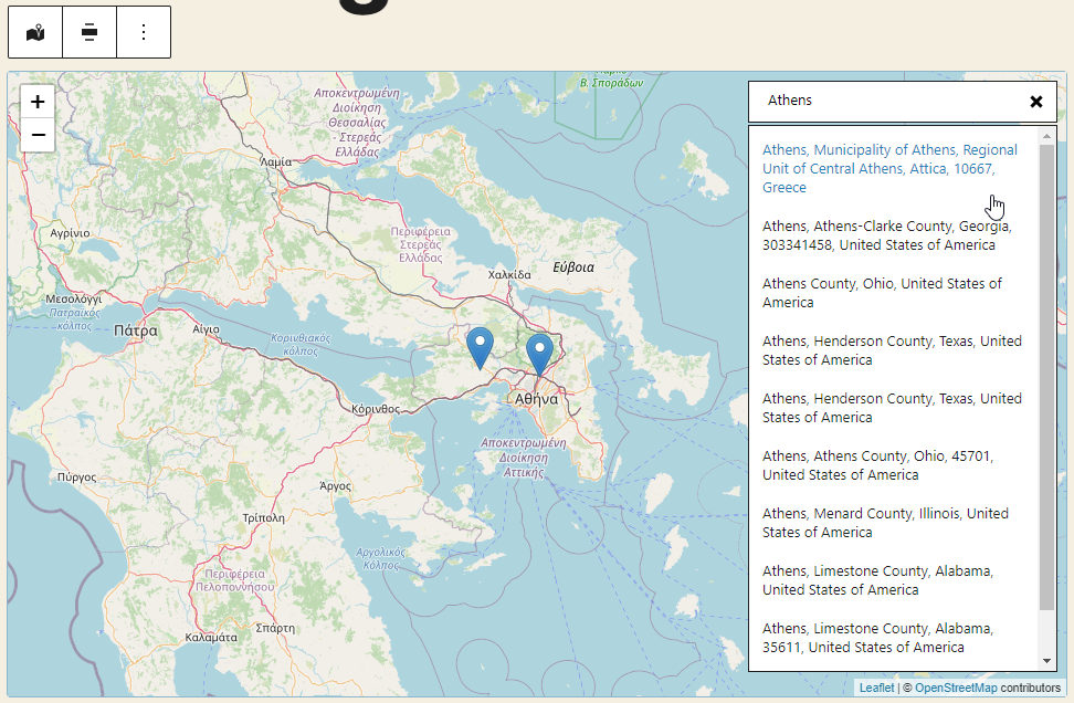
With all of the above, our OpenStreetMap place search improved it’s usability, despite the lack of a “find-as-you-type” functionality. What do you think? Is it usable enough for your needs or the lack of an autocomplete still remains a big inconvenience?
